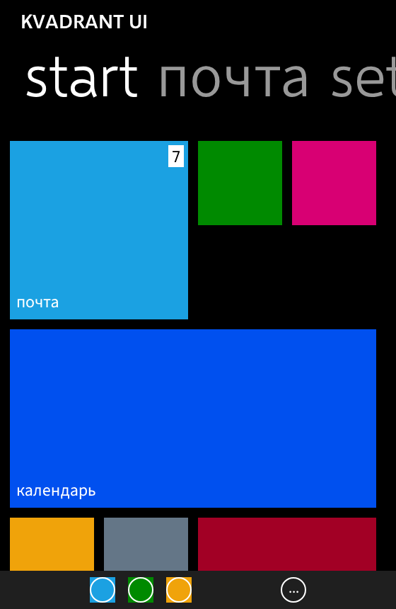
Why it exists
Metro reimplementations are usually built from memory and screenshots, and it shows in the places memory is wrong. The Windows Phone SDK's design-time System.Windows.xaml settles a series of things that looking at pictures gets backwards: a text box is a light field in both themes, focusing it does not bring in the accent colour, and a button's visible border sits inside twelve pixels of invisible touch target.
So every colour, every metric and every motion curve here is generated from a vendored dump of Microsoft's own theme resources rather than typed in — and where no public source exists, the KDoc says so and the number ships as a parameter rather than a constant.
Anything better than the phone is behind a flag
KvadrantTheme(remastered = true) is off by default, and every deviation it enables is a row in the research document saying what it replaces.
With it off, a component that looks nicer than Windows Phone is a defect. That is what keeps the fidelity claim falsifiable: otherwise you can no longer tell a faithful component from a pleasant one by looking. Restoring behaviour the original had is not a deviation and is not gated.
The press feedback is the theme's, not the call site's
KvadrantTheme(
    colors = KvadrantColors.dark(),
    typography = KvadrantTypography.default(kvadrantLatin()),
) {
    KvadrantPage(applicationTitle = "KVADRANT UI", pageTitle = "inbox") {
        KvadrantListItem("Anna Peterson", subtitle = "meeting on Thursday", onClick = {})
        KvadrantButton("reply", onClick = {})
    }
}
KvadrantTheme replaces LocalIndication with the tilt, so anything clickable underneath it leans towards the finger without being asked to — and it replaces LocalOverscrollFactory too, because a Metro list neither ripples nor stretches at its end.
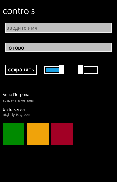
The light theme is not an inversion of the dark one
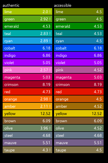
Both are transcribed; neither is derived. The twenty Windows Phone accents ship with their contrast ratios measured, beside accessible variants for the callers who need them — opt-in, because replacing the phone's palette by default would be the same mistake as improving its components by default.
No Segoe file is in the repository
Selawik is Microsoft's own metric-compatible stand-in and is the reason a typeface can ship here at all. It has no Cyrillic, so Source Sans 3 is bundled as the companion and KvadrantText routes per character — a FontFamily list picks weight and style variants and does not fall back on a missing glyph, which was measured rather than assumed.
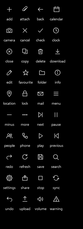
The forty icons are drawn, for the same reason: Segoe's glyph set is not redistributable, and a placeholder set would have been the one part of this library that was invented.
Install
repositories {
    maven("https://reposilite.kotlin.website/snapshots") {
        mavenContent { includeGroupAndSubgroups("io.github.youndie") }
    }
}

dependencies {
    implementation("io.github.youndie:kvadrant-core:0.1.0")
    // Only if the application also uses Material 3.
    implementation("io.github.youndie:kvadrant-material-adapter:0.1.0")
}
kvadrant-core publishes desktop, Android, wasm and both iOS simulator and device targets; the adapter publishes the first three and has no iOS variant.
What it is not
The screenshot suite renders Cyrillic differently under FreeType than under macOS, so it runs on macOS and a golden recorded elsewhere is a different claim. Only the SemiLight weight of the Cyrillic companion is calibrated against the render; the other four Metro weights are not. And wasmJsBrowserTest is skipped, which in a green build reads exactly like a pass — which is why it says so here.