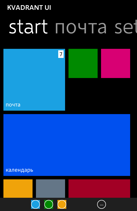
I liked Windows Phone. Not ironically — the flat type, the black that was actually black, the way a list ran off the edge of the screen instead of politely stopping at a margin. The phones are gone and the language went with them, and every so often I wanted it back in something I was building.
So I decided to port it to Compose Multiplatform. That is kvadrant-ui: fifty-one composables, a core that depends on no Material artefact, and an optional adapter for applications that also use Material 3.
The first decision was where to look
Every Metro reimplementation I could find was built the same way: from memory and screenshots. That is the obvious way to do it, and I was about to do the same, because what else is there — the SDK is a decade dead.
Except it isn't, quite. The Windows Phone SDK shipped a design-time System.Windows.xaml, the control templates are plain XAML inside the platform assembly, and the design guidelines are still readable. Once I started reading those instead of squinting at pictures, three things turned out to be backwards in my own memory of the phone:
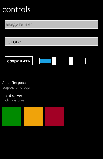
- a text box is a light field in both themes — not a dark one in the dark theme;
- focusing it does not bring in the accent colour;
- a button's visible border sits inside twelve pixels of invisible touch target.
None of those show up in a screenshot. All three are things a reimplementation gets wrong and then defends, because it looks right.
That settled the method. Every colour, every metric and every motion curve in the library is generated from a vendored dump of Microsoft's own theme resources rather than typed in. Eight metrics have no public source anywhere — the Pivot's among them. Those ship as parameters rather than constants, with a KDoc sentence saying the number is mine, so a caller who knows better can override it.
Then I made a rule that made the whole thing harder
KvadrantTheme(remastered = true) is off by default. With it off, a component that looks nicer than Windows Phone is a defect.
This sounds like asceticism and is really about being able to check the work. Without the rule you cannot tell a faithful component from a pleasant one by looking, and every "small improvement" goes in unreviewable. With it, each deviation is a row in the research document saying what it replaces. Restoring behaviour the original had is not a deviation and is not gated — that distinction is the whole value of the flag.
And then I broke my own rule without noticing
Windows Phone 7.1 added two visual state groups to ScrollViewer: HorizontalCompression and VerticalCompression. I read that name and built the effect from it. Content compressed towards the edge being pushed, boundary held still, nothing empty ever appearing.
It shipped. Then it got tuned three times on reports from a real phone — first the depth, then the shape, then the timing — and each round I defended with arithmetic. It never felt right, and I kept adjusting the numbers.
Every one of those rounds was tuning the wrong effect. The design guidelines describe the behaviour in a sentence I had never gone looking for, because I already had a name:
When the end of the list is reached, it will then scroll up to display the empty section and "rubber band" back to rest in place.
An empty section is precisely what a squeeze cannot produce — a squeeze is defined by the boundary not moving. "Compression" names the damping of the manipulation, the scroll being resisted past its end, and says nothing about pixels. Which is also why those visual states carry no storyboard at all: they exist so an application can notice the damping, not so it can draw it.
Later I found the stronger version of the same answer in the platform assembly. LongListSelector's control template is a ViewportControl and a scrollbar, and that control's entire panning surface is Bounds, Viewport, SetViewportOrigin and BounceViewportToBounds. A rectangle over the content plus an origin cannot express a deformation. There is no scale anywhere in the manipulation path.
The tests were on the wrong side
The part that actually stung: my test suite did not merely miss this. It had been written to exclude the correct behaviour, in as many words — it failed any implementation where "the content is sliding away from the boundary rather than squeezing towards it".
Green, specific, carefully argued, and enforcing the mistake for months.
A guard is worth exactly as much as the reading it was written from. And I did not find this myself either — somebody asked "are you sure the content compressed rather than expanded?" Doubt about the premise turned out to be worth more than another iteration inside it.
Using it
repositories {
    maven("https://reposilite.kotlin.website/snapshots") {
        // Filtered, like every third-party repository should be: an unfiltered one takes part
        // in resolving everything.
        mavenContent { includeGroupAndSubgroups("io.github.youndie") }
    }
}

dependencies {
    implementation("io.github.youndie:kvadrant-core:0.1.0")
    // Only if the application also uses Material 3.
    implementation("io.github.youndie:kvadrant-material-adapter:0.1.0")
}
kvadrant-core publishes desktop (JVM), Android, wasm, iosArm64 and iosSimulatorArm64; the adapter publishes the first three and has no iOS variant.
Then wrap the application once:
KvadrantTheme(
    colors = KvadrantColors.dark(),
    typography = KvadrantTypography.default(kvadrantLatin()),
) {
    KvadrantPage(applicationTitle = "KVADRANT UI", pageTitle = "inbox") {
        KvadrantListItem("Anna Peterson", subtitle = "meeting on Thursday", onClick = {})
        KvadrantButton("reply", onClick = {})
    }
}
The press feedback is the theme's rather than the call site's: KvadrantTheme replaces LocalIndication with the tilt, so anything clickable underneath it leans towards the finger without being asked to. It replaces LocalOverscrollFactory too — a Metro list neither ripples nor stretches at its end, and for a long time it did only the first of those, which is how the overscroll above came to be looked at in the first place.
Fonts, because you will hit this immediately
No Segoe file is in the repository, and none can be. Selawik is Microsoft's own metric-compatible stand-in and is the reason a typeface ships here at all — it has no Cyrillic, so Source Sans 3 is bundled as the companion and text is routed per character. A FontFamily list selects weight and style variants; it does not fall back on a missing glyph, which I measured rather than assumed.
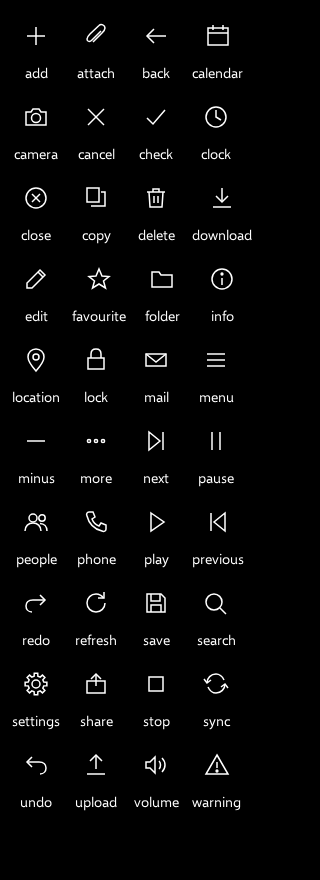
The forty icons are drawn for the same reason.
What it is not
Only the SemiLight weight of the Cyrillic companion is calibrated against the render; the other four Metro weights are not. wasmJsBrowserTest is skipped, which in a green build reads exactly like a pass. And the tilt still gives each surface its own camera where the phone had one camera for the whole screen — the alternative is in the library, switchable in the demo, and off by default.
Nobody has used this API yet, which is the honest reason the version is 0.1.0 and not 1.0.
Source: github.com/youndie/kvadrant-ui · press the components